TODO sample:Try changing the design
Here, let's change the logo image and color of the TODO sample.
Vuetify.js is a UI library that is used in the TODO sample. Vuetify.js is a UI library that can apply material design.
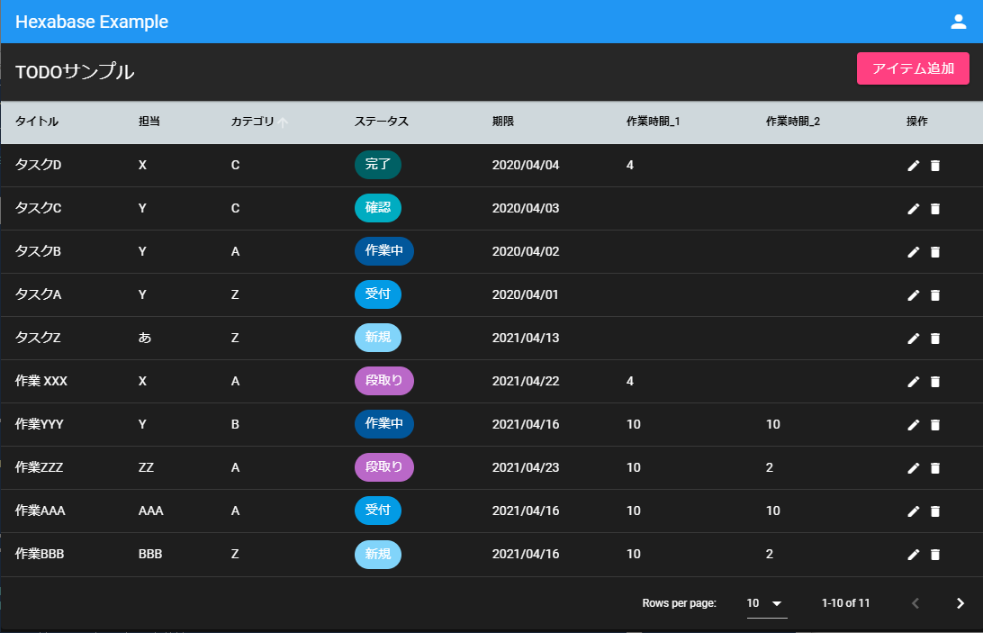
Dark mode
TODO samples can be easily switched to dark mode.
src/plugins/vuetify.js
import Vue from 'vue'
import Vuetify from 'vuetify/lib'

Vue.use(Vuetify)

export default new Vuetify({
  theme: { dark: true },
})
Change Vuetify theme
Vuetify can treat color combinations as themes. Therefore, you can change the color theme of the entire application by simply replacing the Vuetify theme.
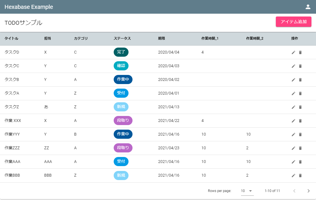
At this time, name the colors according to their location of use and role. Here, the names "primary," "secondary," "accent," and "error" are used.
In the UI part of the TODO sample, a consistent color is specified with this role name.
<v-app-bar color="primary" dense dark>
Then, specify the colors all at once in the Vuetify settings.
src/plugins/vuetify.js
import colors from 'vuetify/lib/util/colors'

// ...

export default new Vuetify({
    theme: {
        themes: {
          light: {
            primary: colors.blueGrey,
            secondary: colors.grey,
            accent: colors.pink.accent2,
            error: colors.pink.lighten2,
          },
        },
    },
});
Colors can be specified using color names such as "colors.blueGrey". To do this,"vuetify/lib/util/colors" is imported into "vuetify.js".
vuetify.js
import colors from 'vuetify/lib/util/colors'
Task list header background
In addition, in the TODO sample, only the header background is written directly in the "ItemList.Vue" style.
src/constants/ItemList.Vue
<style scoped>
::v-deep .v-data-table-header {
  background-color: #cfd8dc;
}

::v-deep th {
  color: #000 !important;
}
</style>