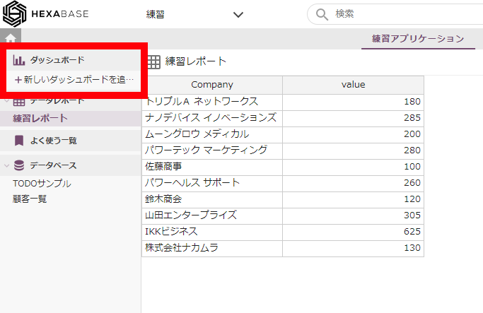
Dashboard
To create graphs in Hexabase, use "Dashboard". "Dashboard" is an area where multiple graphs (charts) are compiled. The graphs displayed on the "Dashboard" are created based on the "Data Report".
Let's create a dashboard
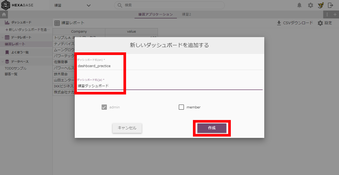
1. Click "+ Add New Dashboard"
2. Enter a dashboard name and click the "Create" button.
Let's make a chart
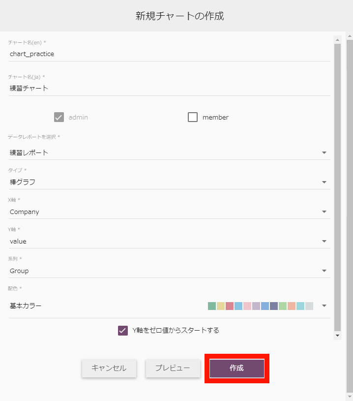
When creating a chart, a minimum of three fields are required in the data report.
1. After creating the dashboard, it's time to create the chart.
2. Click the "Add new chart" button.
3. Enter the chart name and select the data report to graph.
4. select the following for "Create New Chart":
- Data report: Practice report
- Type: Bar graph
- X Axis: Select a text type field "company"
- Y-axis: Select a numeric field "value"
- Series: Select a text type field "Group"
- Color Scheme: Basic Color
5. After setting all items, click the "Create" button.
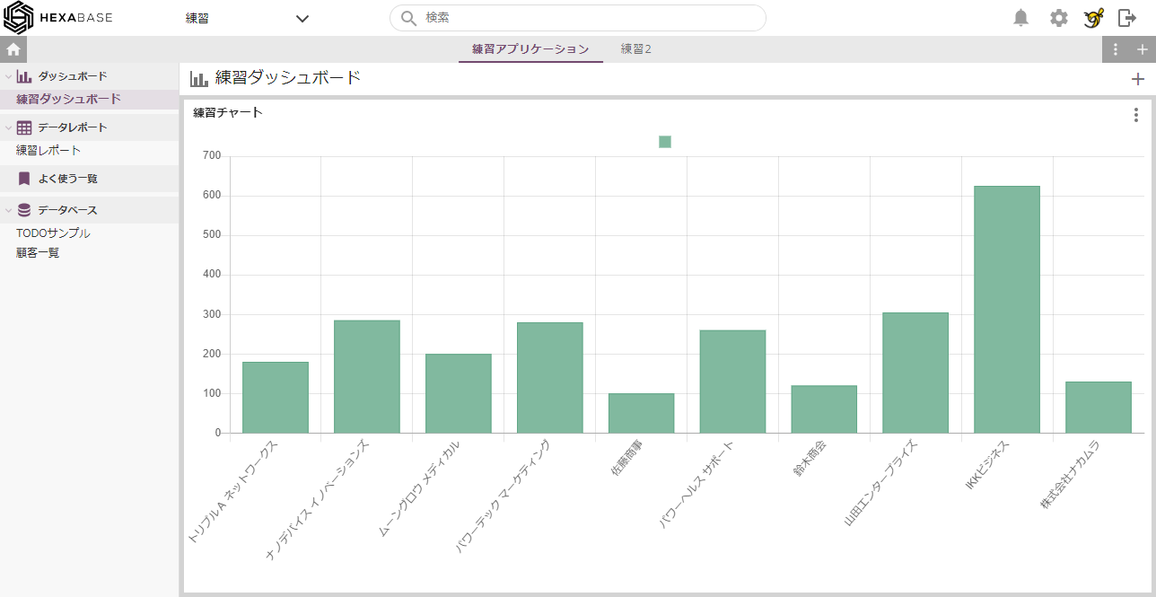
Click the button ... and it's done!
※ The only item that can be selected as the "Y axis" is the "numeric" type.
"Numeric" type fields cannot be selected for the "X Axis" and "Series" items. Field types are set when the database is created.
Create a second dashboard
1. Hover the mouse over "Dashboard" on the left and click the [⁝] setting button.
2. Click on "Add a new dashboard" from the menu.
3. Enter a name for the dashboard and click the "Create" button.
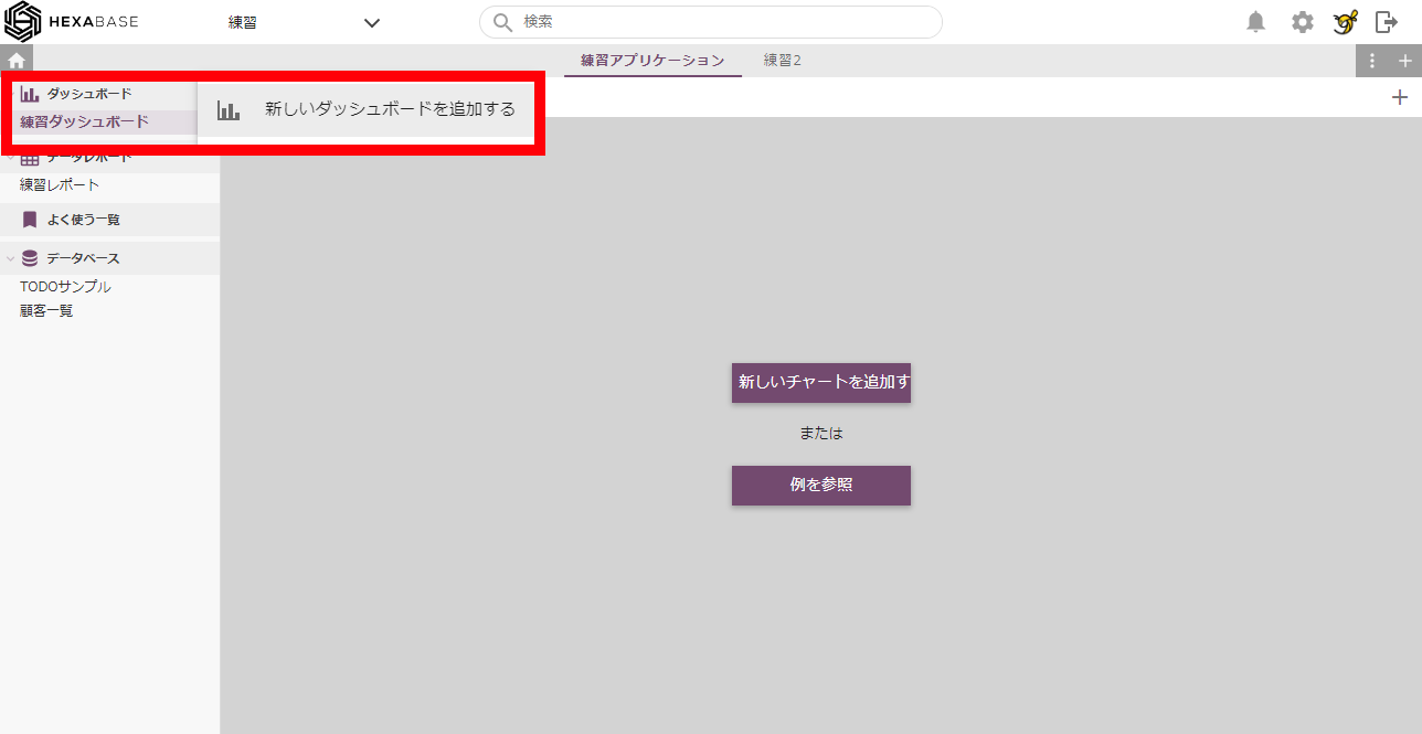
Chart navigation
To add a new chart, use the [+] button at the top right of the dashboard.
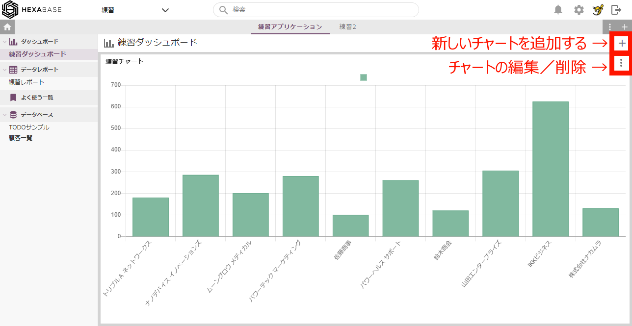
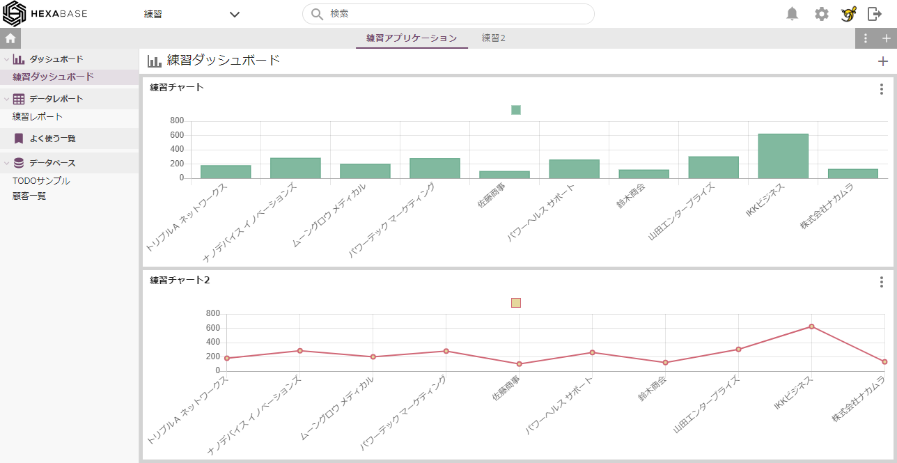
If you have multiple charts, you can change the layout by dragging and dropping the boundaries.
Thank you for your hard work!
This concludes the Hexabase Getting Started Guide.
We have provided a brief overview of Hexabase's basic operations.
Please refer to the Administrative panel reference section for further information on utilizing the administrative panels.